(Originally published on the UX Bookclub)
Usable design is good. Emotional design is better.
I first read Emotional Design in graduate school. I considered it light reading, compared to all of the thick, indecipherable academic texts I was consuming at the time. I remember loving it. But over-time, I started to forget the details. The message didn’t stick with me.
Fast forward to a few weeks ago when I saw Emotional Design as part of a library display of design books. I decided, on a whim, to take it home with me and read it for a second time. I’m glad I did.
Throughout the book, Norman provides stories about products that connected with him on an emotional level. And with each example, he discusses them with respect to three levels of emotional design:
- Visceral — the pre-conscious gut reaction. The includes the aesthetics and overall appearance of the product. When we immediately think of a product looking cute, sexy, scary, etc. those are our visceral reactions.
- Behavioral — the conscious use and experience with the product. This includes the function, performance, and usability of the product. The more effective the product, the happier the user.
- Reflective — the interpretation and understanding of the product. This combines both the emotional and cognitive reactions to the product, and taps into the users’ self-image, memories, experiences, and culture.
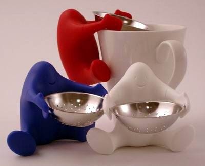
For example, he discusses his experience with Pirovano’s Te ò tea strainer.

At the first glance, the tea strainer is cute (visceral). It has a happy face and cute chubby legs that make you smile. Then, you realize, it is more than just cute, it’s functional (behavioral). When you see the tea strainer perched on the edge of a mug ready for tea to be poured through you can’t help but feel pleasure. The tea strainer is both cute and functional. It is also a tea strainer that, depending on your personality, might be something you display (reflective). You might enjoy looking at, and having others look at it, even when you are not using it. Norman says he keeps the tea strainer perched on a shelf in his kitchen, next to his teapots, where everyone can see.
And, while the tea strainer might work like any other tea strainer we’ve used before, because we find it cute and fun we might think it actually works better.
Attractive things do work better — their attractiveness produces positive emotions, causing mental processes to be more creative, more tolerant of minor difficulties. (p. 60)
Norman also points out that the tea strainer remains fun even after considerable use. Designs that can connect with users at the visceral, behavioral, and reflective level are often able to stand the test of time.
Similarly, this book stands the test of time. It was published in 2004 and uses product examples from that era, but absolutely every detail still rings true. Also, from a personal perspective, I found that I was much better able to appreciate the lessons this book offered the second time around. In grad school, I was mainly concerned with producing the next publishable thing. Whereas now I want to make products people use and love.
It can be easy to get wrapped up in the behavioral aspects of design, such as focussing on the pure usability of a product. But Don Norman’s “Emotional Design” has taught me that usable designs are good, but great designs connect on a emotional level.
Bookclub Discussion
- What was the last product you looked at that produced an emotional, visceral response from you?
- What strategies do you use to connect with users at the visceral or reflective levels?
